
Back
Pens.com Case Study
Pens.com Customizer Case Study
Transforming the personalization experience to increase trust, usability, and conversion.


Role
Lead Product Designer


Timeline
3 months (Q2 2024)


Tools
Figma, Google Analytics, Hotjar, UserTesting
The Challenge
Pens.com's legacy customizer was causing significant friction in the purchase journey. Users struggled with an unclear user flow, limited preview capabilities, and a fragmented mobile experience.
The challenge was to redesign the customization flow to build trust, reduce confusion, and ultimately increase conversion while maintaining the brand's established aesthetic and supporting complex product configurations.
The Original Experience
The existing customizer had served the business for years, but analytics and user feedback revealed significant pain points that were impacting conversions and customer satisfaction.
"I wanted to order custom pens for our company, but I couldn't figure out how to edit the design. I gave up and went to a competitor."
— Survey Respondent, Small Business Owner
Before Redesign
Research & Discovery
We conducted a comprehensive research phase to identify pain points and opportunities. This included quantitative analytics, qualitative user interviews, and competitive analysis.


Analytics
42% drop-off rate at the customization step. Mobile abandonment was 68% higher than desktop.

User Feedback
15 user interviews revealed confusion around customization, difficulty visualizing final products, and frustration with mobile experience.


Competitive Analysis
Reviewed 8 competitors. Best-in-class featured real-time preview, transparent pricing, and unified mobile/desktop experiences.
User Testing Results
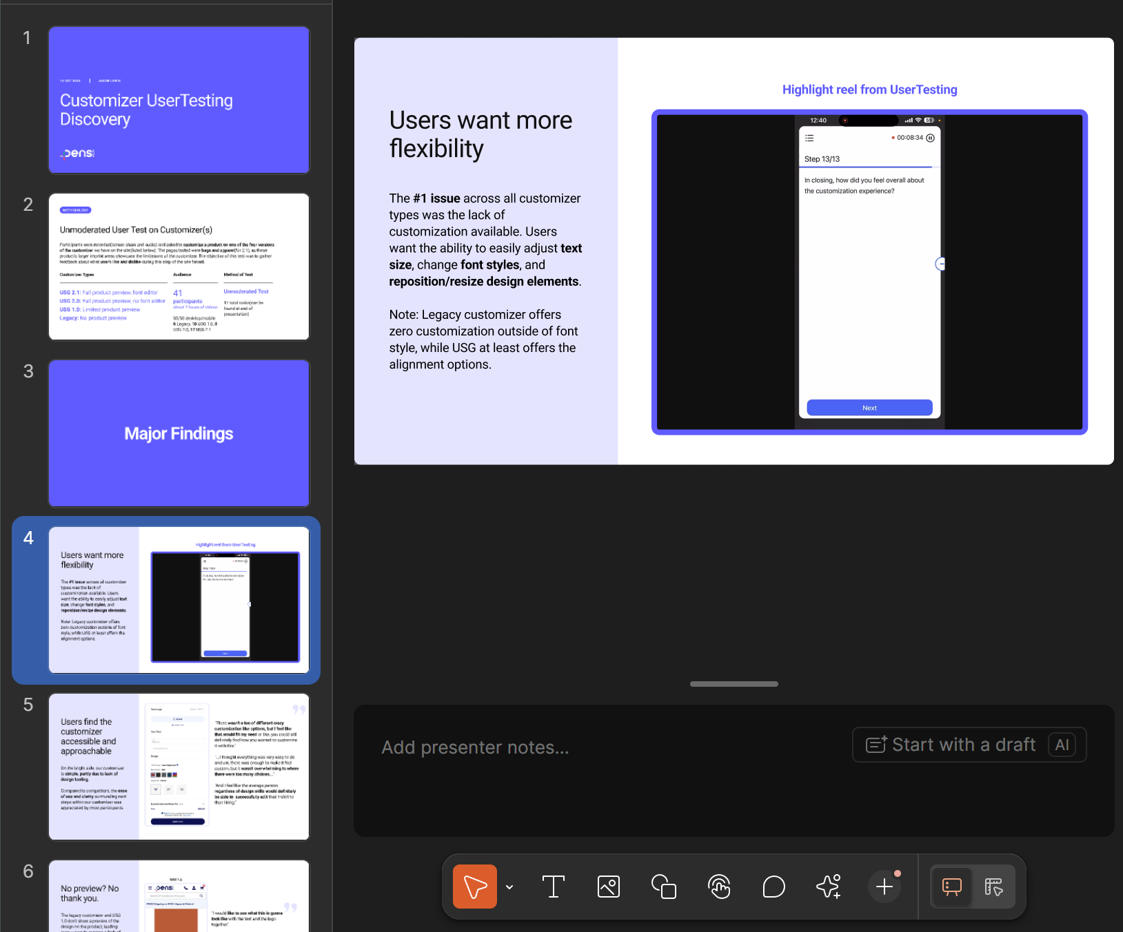
I conducted unmoderated usability sessions with Pens.com customers via Usertesting.com, including small business owners and event planners, and found that unclear editing controls and low-fidelity previews left users uncertain about their designs, which often led them to abandon checkout. I presented this research via a Figma slide deck to present to stakeholders.
User Testing Findings(Figma Slides)
Defining the Strategy


Problem Definition
Through research synthesis, we identified three core problems:

The long scrolling of the page made it unintuitive to design the product
Limited preview capabilities meant users couldn't visualize their final product
Fragmented mobile experience led to high abandonment rates
Ideation and Wireframing
Based on the research findings, an intuitive app-like interface was selected as the design direction. This would allow the user to have a clear view of both their product and the customizer’s controls at all times. We iterated through multiple wireframe versions, testing key interactions and flows with users before committing to high-fidelity designs.
Initial Wireframes
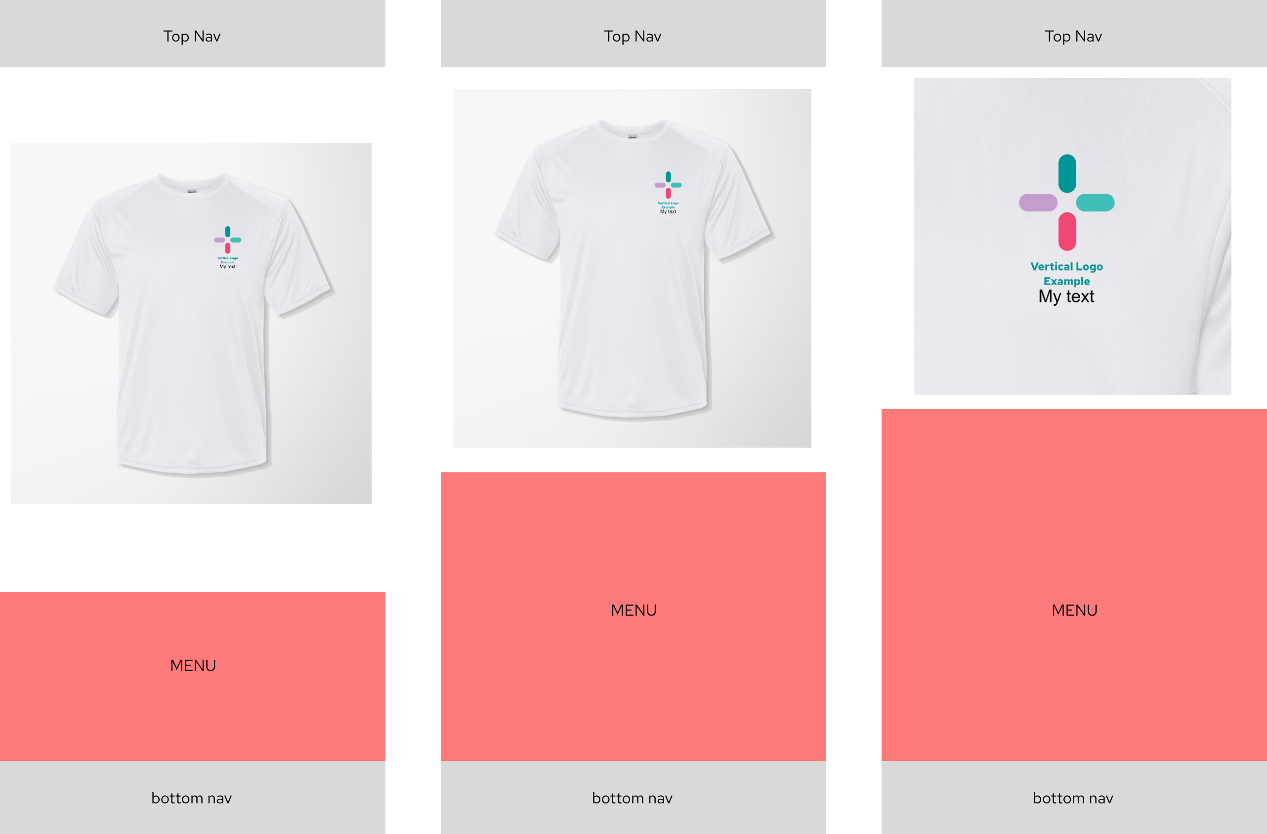
Mid-fidelity Design
Final Design
The redesigned customizer provides a seamless, trustworthy experience with real-time preview, transparent pricing, and a fully responsive interface.
Unified Customizer
Single, coherent interface that works seamlessly across all devices and screen sizes.
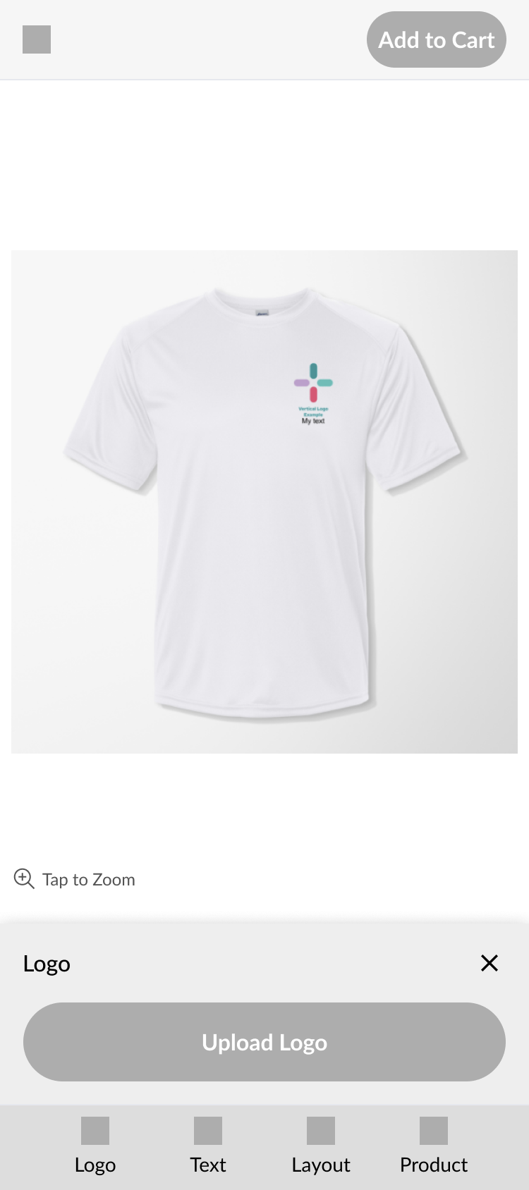
Persistent CTA
A consistent, highly visible CTA that is always present allows user to check out without having to scroll to the bottom of a long page.
Real-Time Preview
Instant visual feedback as users make selections, building confidence in their purchase.
Smooth Animations
The animations between the different toolbar menus creates a frictionless experience for the user.
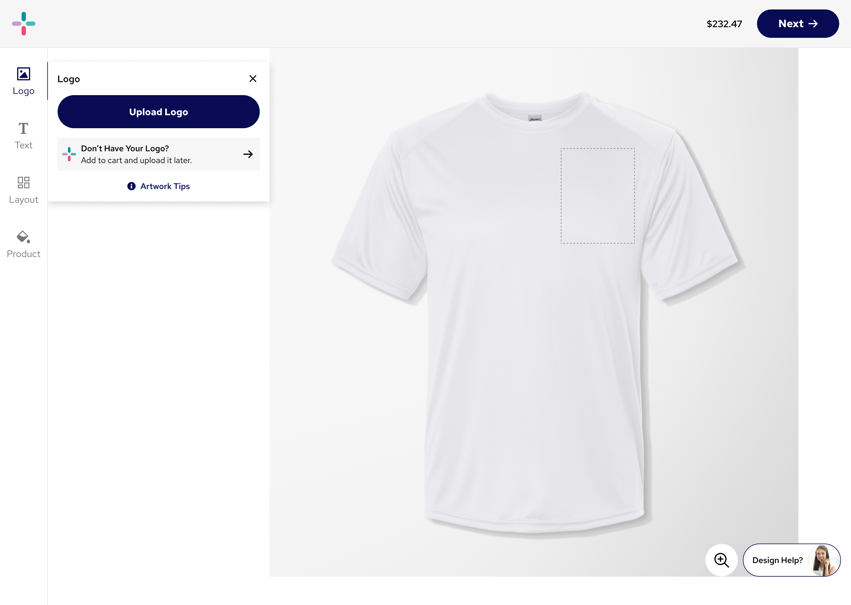
App-like toolbar
The new bottom nav allows users to quickly edit the product how they want, using an intuitive bottom nav bar that users are familiar with.
Mobile High-Fidelity Prototype Video
Desktop Screenshot
Results & Impact
↑ 9%
Conversion rate increase
↓ 42%
Support calls about customization
↑ 24%
Mobile customization completion
Usability testing showed that the new customizer improved the experience by making the process clearer and more intuitive. Participants were able to upload logos, edit text, and adjust colors without excessive scrolling, which reduced confusion compared to the old version. The real-time product preview gave users confidence that their design would look as expected, and many noted that they no longer felt the need to call customer service for help. The consistent layout across product types also eliminated the disjointed experience of the previous flows, and the responsive design worked smoothly on mobile devices.

"The new customizer is fantastic! I could actually see what my pens would look like before ordering. Made the whole process so much easier and gave me confidence in my purchase."
Sarah Mitchell
Marketing Director, TechStart Inc.

Key Learnings
1
Mobile-first is essential
With 60% of traffic coming from mobile devices, optimizing for touch and smaller screens wasn't optional—it was critical to business success.
2
Stakeholder input is crucial
Stakeholder feedback is essential because it ensures that the design aligns with business goals, technical constraints, and customer needs. It also helps secure buy-in early, reducing costly misalignment or rework later in the process.
3
Test early and often
Usability testing at the wireframe stage saved significant development time and prevented us from building features users didn't need or want.
4
Data drives decisions
Combining quantitative analytics with qualitative user feedback gave us a complete picture and helped prioritize the most impactful improvements.
Back
Pens.com Case Study
Pens.com Customizer Case Study
Transforming the personalization experience to increase trust, usability, and conversion.
Role
Lead Product Designer
Timeline
3 months (Q2 2024)
Tools
Figma, Google Analytics, Hotjar, UserTesting
The Challenge
Pens.com's legacy customizer was causing significant friction in the purchase journey. Users struggled with an unclear user flow, limited preview capabilities, and a fragmented mobile experience.
The challenge was to redesign the customization flow to build trust, reduce confusion, and ultimately increase conversion while maintaining the brand's established aesthetic and supporting complex product configurations.
The Original Experience
The existing customizer had served the business for years, but analytics and user feedback revealed significant pain points that were impacting conversions and customer satisfaction.
"I wanted to order custom pens for our company, but I couldn't figure out how to edit the design. I gave up and went to a competitor."
— Survey Respondent, Small Business Owner
Before Redesign
Research & Discovery
We conducted a comprehensive research phase to identify pain points and opportunities. This included quantitative analytics, qualitative user interviews, and competitive analysis.
Analytics
42% drop-off rate at the customization step. Mobile abandonment was 68% higher than desktop.
User Feedback
15 user interviews revealed confusion around customization, difficulty visualizing final products, and frustration with mobile experience.
Competitive Analysis
Reviewed 8 competitors. Best-in-class featured real-time preview, transparent pricing, and unified mobile/desktop experiences.
User Testing Results
I conducted unmoderated usability sessions with Pens.com customers via Usertesting.com, including small business owners and event planners, and found that unclear editing controls and low-fidelity previews left users uncertain about their designs, which often led them to abandon checkout. I presented this research via a Figma slide deck to present to stakeholders.
User Testing Findings(Figma Slides)
Defining the Strategy
Problem Definition
Through research synthesis, we identified three core problems:
The long scrolling of the page made it unintuitive to design the product
Limited preview capabilities meant users couldn't visualize their final product
Fragmented mobile experience led to high abandonment rates
Ideation and Wireframing
Based on the research findings, an intuitive app-like interface was selected as the design direction. This would allow the user to have a clear view of both their product and the customizer’s controls at all times. We iterated through multiple wireframe versions, testing key interactions and flows with users before committing to high-fidelity designs.
Initial Wireframes
Mid-fidelity Design
Final Design
The redesigned customizer provides a seamless, trustworthy experience with real-time preview, transparent pricing, and a fully responsive interface.
Unified Customizer
Single, coherent interface that works seamlessly across all devices and screen sizes.
Persistent CTA
A consistent, highly visible CTA that is always present allows user to check out without having to scroll to the bottom of a long page.
Real-Time Preview
Instant visual feedback as users make selections, building confidence in their purchase.
Smooth Animations
The animations between the different toolbar menus creates a frictionless experience for the user.
App-like toolbar
The new bottom nav allows users to quickly edit the product how they want, using an intuitive bottom nav bar that users are familiar with.
Mobile High-Fidelity Prototype Video
Desktop Screenshot
Results & Impact
↑ 9%
Conversion rate increase
↓ 42%
Support calls about customization
↑ 24%
Mobile customization completion
Usability testing showed that the new customizer improved the experience by making the process clearer and more intuitive. Participants were able to upload logos, edit text, and adjust colors without excessive scrolling, which reduced confusion compared to the old version. The real-time product preview gave users confidence that their design would look as expected, and many noted that they no longer felt the need to call customer service for help. The consistent layout across product types also eliminated the disjointed experience of the previous flows, and the responsive design worked smoothly on mobile devices.
"The new customizer is fantastic! I could actually see what my pens would look like before ordering. Made the whole process so much easier and gave me confidence in my purchase."
Sarah Mitchell
Marketing Director, TechStart Inc.
Key Learnings
1
Mobile-first is essential
With 60% of traffic coming from mobile devices, optimizing for touch and smaller screens wasn't optional—it was critical to business success.
2
Stakeholder input is crucial
Stakeholder feedback is essential because it ensures that the design aligns with business goals, technical constraints, and customer needs. It also helps secure buy-in early, reducing costly misalignment or rework later in the process.
3
Test early and often
Usability testing at the wireframe stage saved significant development time and prevented us from building features users didn't need or want.
4
Data drives decisions
Combining quantitative analytics with qualitative user feedback gave us a complete picture and helped prioritize the most impactful improvements.